Platforms

Case studies
Resources
Merchants
About us
Overview
This document walks you through preezie best practices. On average preezie shoppers convert 300 – 400% higher than non preezie shoppers. Commonly, the challenge is getting as many people to use our platform as possible.
Why does this matter, let us do an example:
|
preezie utilisation |
Your site (no preezie) |
Your site (with 10% preezie) |
Your site (with 25% preezie) |
|
Sessions |
1,000,000 |
1,000,000 |
1,000,000 |
|
Conversion rate |
1.4% |
preezie shoppers = 4.9%, non preezie shoppers = 1.4% |
preezie shoppers = 4.9%, non preezie shoppers = 1.4% |
|
Average order value |
$185 |
$185 |
$185 |
|
Revenue |
$2,590,000 |
$3,237,500 |
$4,208,750 |
*Assuming preezie converts 350% above average 1.4% = 4.9%.
From the above example you can see that without preezie you make $2,590,000 per month online, however if 10% of your sessions use preezie revenue goes up by $647,500 to $3,237,500 and if 25% of your sessions use preezie revenue goes up by $1,618,750 to $4,208,750.
Our goal is to get the preezie conversion rate as high as possible then get as many sessions using preezie as possible.
See the next page for preezie recommended best practices. This list is ordered in order of impact and priority. Therefore, start from top to bottom. To achieve the most out of the preezie platform we recommend you implement all the below best practices.
Best Practices
1. Features and exposure
1.1 Workflows at the top of collection pages
preezie gets the most usage when being integrated at the top of collections pages. The best way to think of this is like an in-store sales assistant. Assume you walk into a physical retail store and approach the products you are interested in, for examples TVs, Running Shoes, Dresses and then a sales assistant starts helping guide you, great right? Integrating preezie at the top of collection pages allows you to replicate this experience online.
Myth busted: Not seeing products above the fold on collection pages reduces conversion rate and customer experience. Most of our customers see conversion rates increase when placing preezie at the top of collections pages, even if that means products are not visible above the fold. Having said that we can make our widget smaller, so you ensure products are visible above the fold.
Examples:
Guitar Center – acoustic guitars collection page

Baby Bunting – car seats collection page

Lorna Jane – leggings and tights collection page

1.2 Cover all your range
How much of your range are you covering in terms of sessions and revenue? Most retail partners can have dozens of workflows. For example, your site may have 20-30 categories, all of which could use a preezie workflow, however building 20-30 workflows may not be feasible.
The best way to cover this is to start from top to bottom in terms of sessions and revenue. For example, let us say you sell appliances online, work out which categories get the most sessions and revenue.
For example, assuming your site gets 10,000,000 sessions, 1% conversion rate and $200 AOV. That is $20,000,000 per month from 10,000,000 sessions.
Now do a breakdown.
- TVs – 1,000,000 sessions, $2,000,000
- Fridges – 800,000 sessions, $1,200,000
- Air conditioners – 750,000 sessions, $1,100,000
- Ovens – 500,000 sessions, $900,000
- Laptops – 450,000 sessions, $670,000
- Etc
From here start working your way down the list in terms of a preezie implementation. In this example, TVs first, then Fridges, Air cons, ovens, laptops, etc.
As a benchmark for retail partners that have lots of potential categories, we attempt to cover 80% of their sessions and/or revenue.
1.3 Exit intents or pop-ups
Exit intents allows preezie to measure “the intent” of a person who is about to exit and show a popup before they leave. Further to that we can also run timed popups for email collection.
Guitar Center – acoustic exit intent. “Before you go… let us help you find your perfect guitar!”
Baby Bunting – car seats exit intent. “Before you go…”

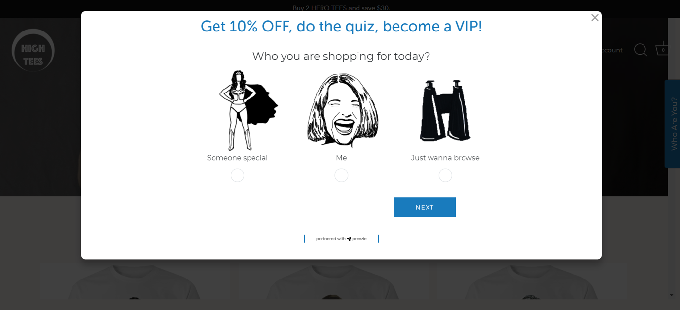
High Tees – 15 second delayed popup with coupon code and email capture form
1.4 Workflow high on homepage
Once you cover enough of your range it has been extremely successful to integrate preezie at the top of the homepage.
As preezie converts so highly it is often the most valuable content on a page, this position also gets a reasonable amount of usage.
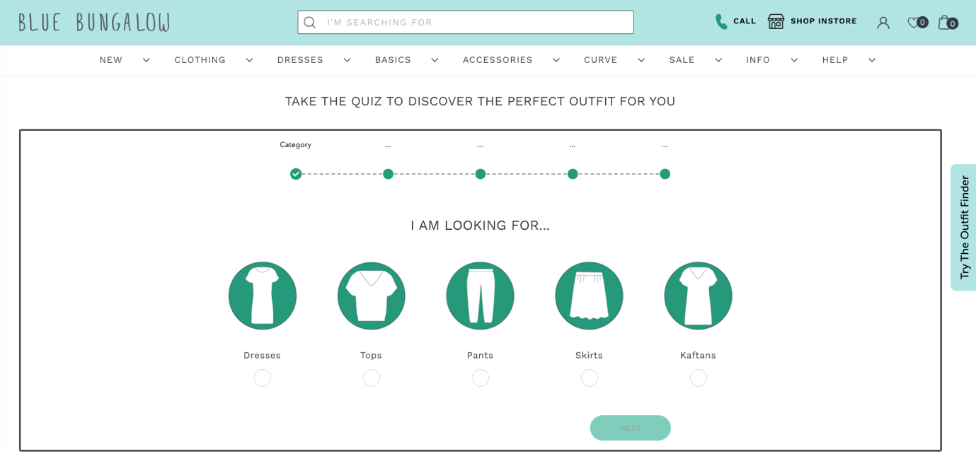
Blue Bungalow – top 5 categories directly in one workflow high on homepage
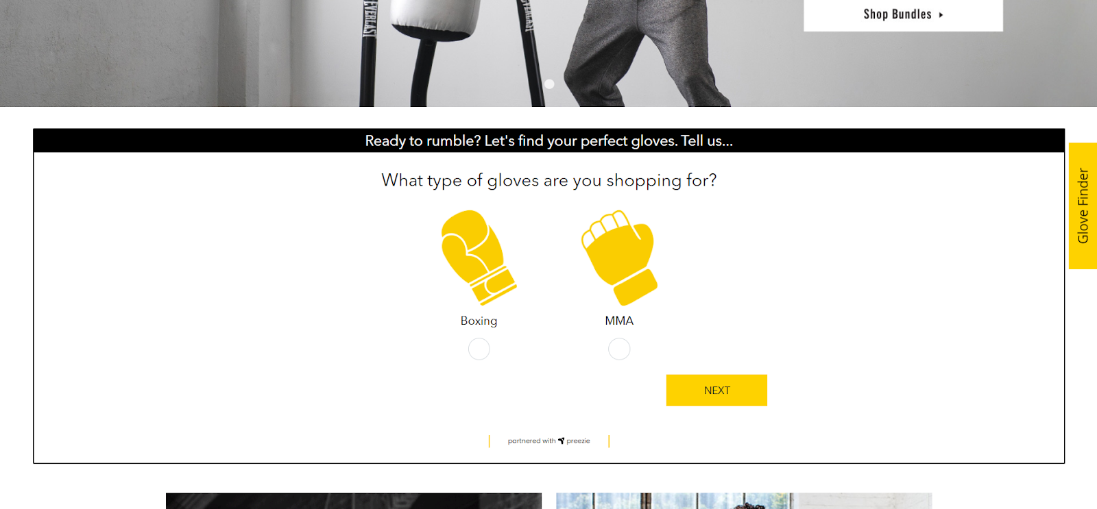
Everlast Australia – just below the hero banner
Curvy Bras – just below 3 hero tiles, starting with a valuable question addressing shopper mission

Bay Sports – strong iconography makes preezie workflow stand out on a very image rich page

1.5 Menu link
Once you have a dedicated page you can then prompt users to get help from your navigation and menu links.
Current Body – “HELP ME CHOOSE – TAKE OUR QUIZ” navigation menu.

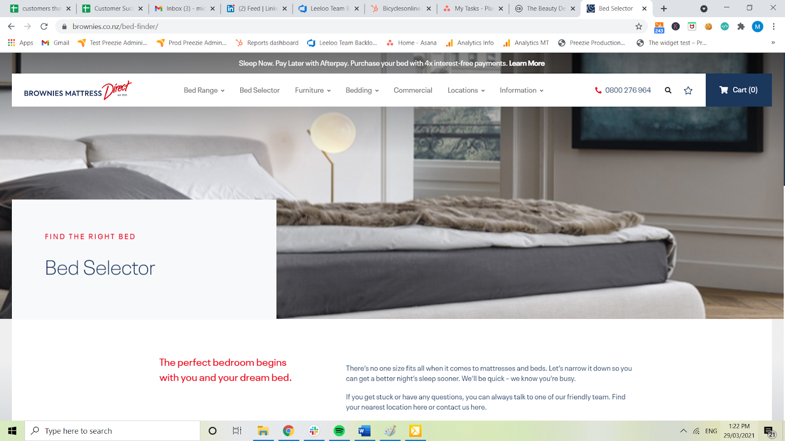
Brownies Mattress – “Bed Selector” menu link.
1.6 Email capture
Email capture is one of our most powerful features and we have seen outstanding results. Often, we can replace current email capture pop-ups while also providing your consumers a fun, insightful and interactive journey with product recommendations.
Hint: We have seen email capture rates double in comparison to typical email capture pop-ups.
HIGH TEES – 15 second delayed site wide pop-up with email capture (start of the journey – before starting the quiz)

HIGH TEES – 15 second delayed site wide pop-up with email capture (middle of the journey – once completed the quiz)

HIGH TEES – 15 second delayed site wide pop-up with email capture (end of the journey – once email captured, the coupon is delivered, products are recommended)

1.7 Personalisation widget on product pages
Once a user has completed a preezie workflow, we understand what that user is looking for. From there we can integrate a widget on the product detail pages that can articulate how well a product matches that person.
When users engage with our personalisation widget on product pages, conversion rate goes up between 600 – 900%.
Bevilles – watch personalization widget, 80% match.

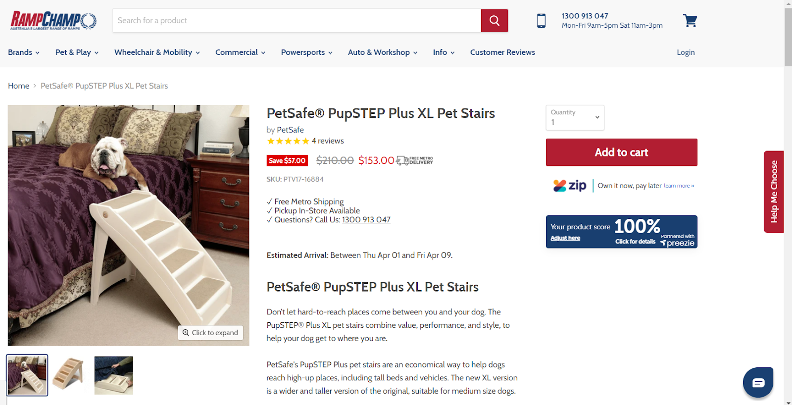
Ramp Champ – pet ramp finder, 100% match.
1.8 Targeted call to actions
Targeted call to actions are small buttons that float on the left, bottom or right hand side of the screen with simple call to action text.
Curvy – bottom right-hand corner “Bra Size Quiz” call to action button.

Curvy – “Bra Size Quiz” call to action button once clicked.

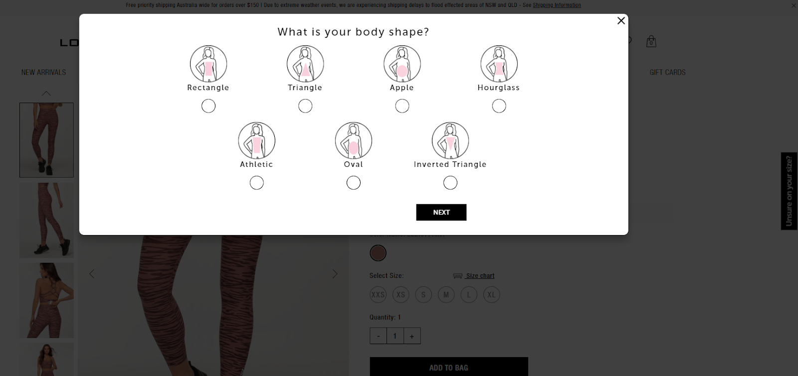
Lorna Jane – middle right-hand side “Unsure on your size?” button.

Lorna Jane – “Unsure on your size?” call to action button once clicked.
1.9 Dedicated landing page
Often customers want to push specific or dedicated traffic to use preezie. This could be ads, banners, or just general marketing campaigns. In order to push traffic to preezie without too many distractions its best to create a new landing page dedicated to preezie. For example: www.example-site.com/rug-finder.
MissAmara – created a persona called Cleo, the rug stylist.

Sportitude – dedicated shoe finder page with banner explainer.

1.10 Integrate preezie with search
Similar to our call to actions. You can call our popups via any event or button click. For example, place a call to action to get help under or among your search function.
Current Body – when searching prompt wit “need help choosing? Find a device for me”.

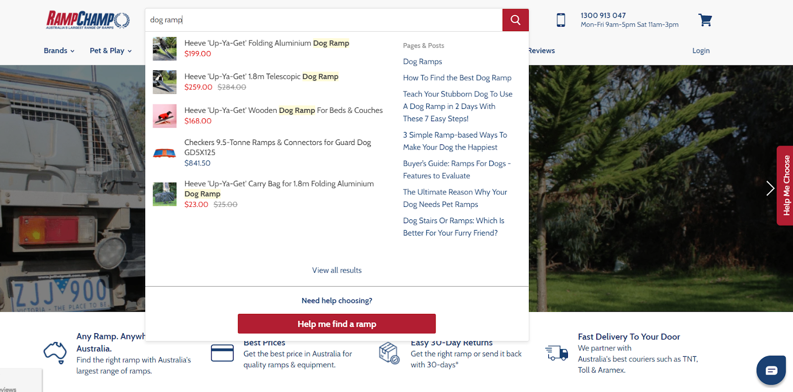
Ramp Champ – bottom of search bar “Need help choosing? Help me find a ramp”.
2. Behavioural psychology, copy and design
This section of our best practices touches on the behavioural psychology of eCommerce and how to best implement the preezie workflows. Please note preezie has built a comprehensive document called, “The behavioural psychology of Guided Conversion”. If you would like a copy of this document please reach out to you customer success manger or download it below:
2.1 Narrative and segmentation
Your preezie workflows should create a narrative consumers can follow that are segmented and embeds your brand story.
Considerations are:
- Develop an identity
- Make it an experience
- Embed your brand story
- Build personas and segment your journeys (when possible)
Example of “Develop an identity” - Black Pepper, Try “Bella” their virtual stylist

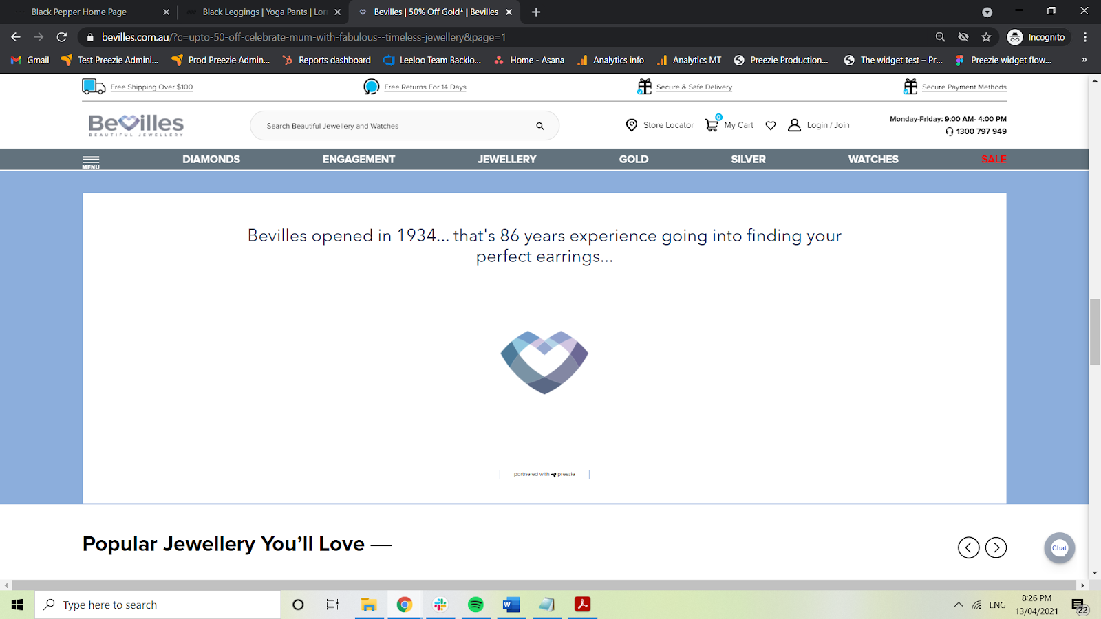
Example of “Embed your brand story” - Bevilles – A fun fact during the loading screen
2.2 Structure
The structure of preezie refers to the order of the questions and answers and where you place the workflows within your site. Did you know that psychology shows us people form stronger memories of the first and last items in a series and have the least strong recall of middle items in a set. This is called “Serial-position effect”.
When creating the questions and answers for your preezie workflows ensure that the elements that hold the most value are seen first and last. Use the most engaging questions at the beginning and end of the workflow.
Hint: do not start workflows with questions that are too generic, for example: “Is this for a gift”.
Lorna Jane – leggings and tights collection page
In the above the first question is extremely engaging, thoughtful and gets straight into the application or occasion.
2.3 Design
Design is critical and needs to ensure your workflows stands out while being on brand. Salience - Refers to how noticeable something is as a function of it standing out in its environment. The more distinct something is in its environment the more attention and significance will be paid to it.
When thinking about a design you need to consider:
- Contrast – Ensure the workflows distinguish themselves from the other elements
- Imagery – Use strong and clear images that tell a story or evoke emotion
- Clarity – Do not make customers guess, make it simple
- Choice – Do not offer to many answers or results, avoid choice paralysis
- Perception – preezie is a world class experience, ensure you give it that perception on-site
Example of “Contrast and imagery” – Guitar Center – Stands out with great images

Example of “Clarity” – Baby Bunting – Dynamic text that explains answers

2.4 Language and copy
The use of strategic language will prime the customer for conversion. Three areas to ensure you pay attention to is:
- Use priming language. Exposure to one idea or stimulus influences how subsequent ideas are interpreted. This means that what your customers see at the start of the preezie journey will affect how they react later, even if the two elements are unrelated.
Example: Have copy when waiting for results, for example: “personalising your holiday package” or “searching 1,000 watches to find your perfect one”.
- Create an endowment effect. People place a greater value on things they believe they have some ownership of and don’t want to part with. Use language that suggests personal ownership. Even try an assumptive close.
Example: Use words like “you” and “yours”, not “it”. Assumptive close could be “Which of these guitars are you taking home today?”
Guitar Center – Use of the words “Your” creates ownership

- Authority bias and social proof. People place more trust in the opinions of individuals who are perceived to have authority. This can be your brand, a specific person or even preezie. Consider the expertise, individual and social bias.
Example: During the loading screen or on the results pages try copy like “Join over 1,000,000 happy customers” or “preezie and Oz Hair & Beauty are finding your perfect products”.
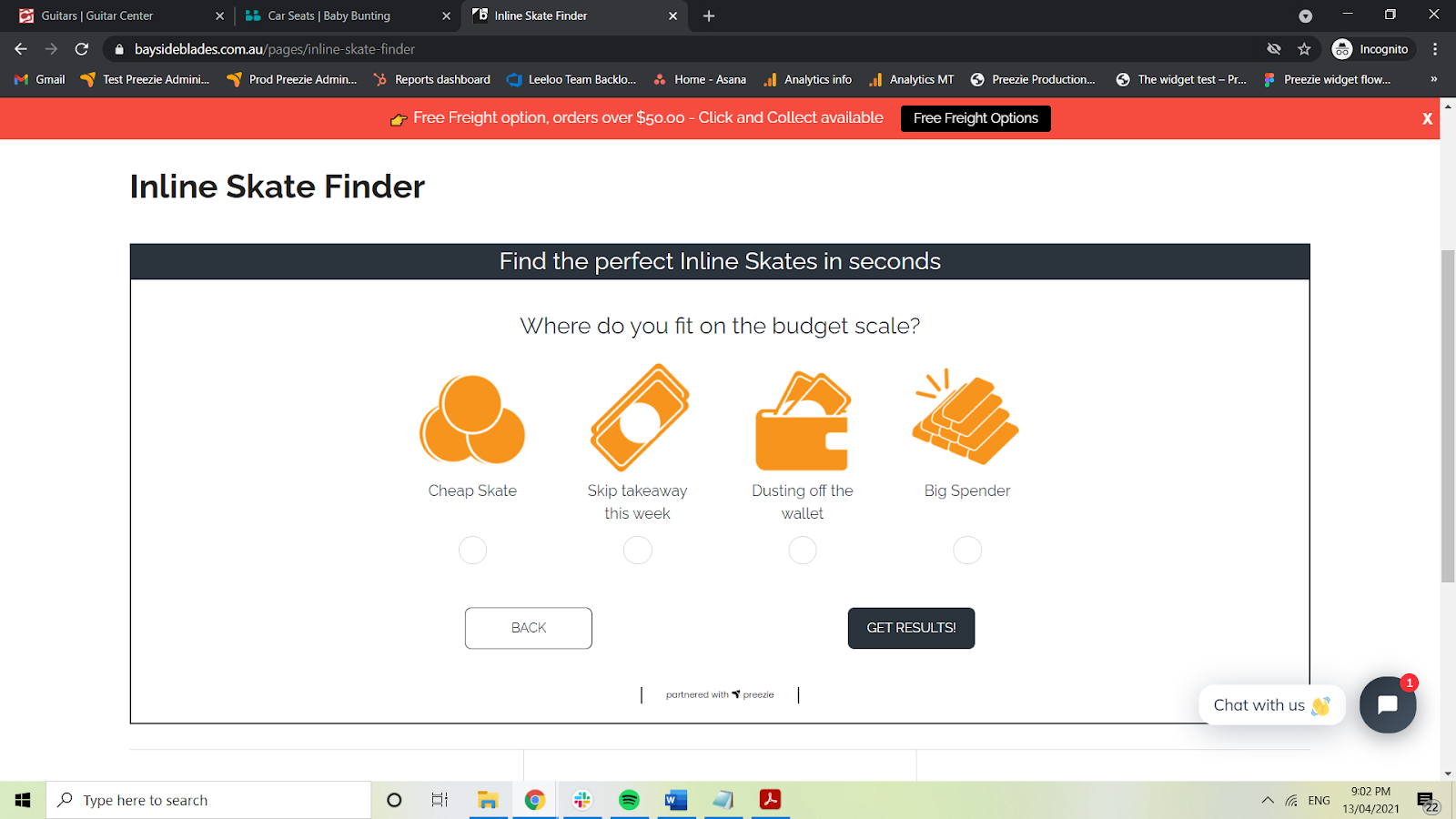
2.5 Framing price
When talking about price consider how you wish to frame it. The perception of price can be determined by the way it is framed through language. Consider how you talk about price, is it a “price, budget, investment, cost, etc”.
Make it easy to understand. Consider conveying the “cost” with conceptual language e.g. “No skimping”, “skip takeaways for a week”, “Only the best”.
Bayside Blades – use terms like cheap skate and big spender to reference different budgets.
Other considerations:
Anchoring - Some numbers act as a reference point for comparing options. Numbers seen first or seen most often set the considerations and expectations. Therefore, if you are looking to increase AOV and would normally start with “under $50”, try starting with “under $70 or $100”, this will anchor expectations to higher numbers.
Aversion to extremes - Preference to avoid the most extreme high and low points of a scale or options. If you have a few products that are $5 and $5,000, avoid these if possible.